|
In the Collect Earth survey I have two dropdown menus side by side and they don't quite fit. Which part of the balloon.html I should fix to make the balloon itself and dropdown menus wider? thanks, Ulpu |
|
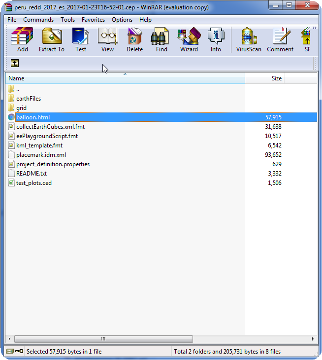
Dear Ulpu, If you open the CEP file with a compression application like WinRAR or WInZIP, you can see the contents of it (as a CEP file is just a ZIP file that has a different extension) One of the files within the CEP file is called balloon.html . You should modify this HTML or the CSS files (styling files) that are contained inside earthFiles/css/earth.css After you modify the files, you should save it again and then open the CEP file again through Collect Earth in order for the KML that is opened by Google Earth to be updated with the new styling. Of course, if you export the CEP file through Collect again you will need to copy over the changes made in the previous CEP file so that the new one would have the same layout!
|

